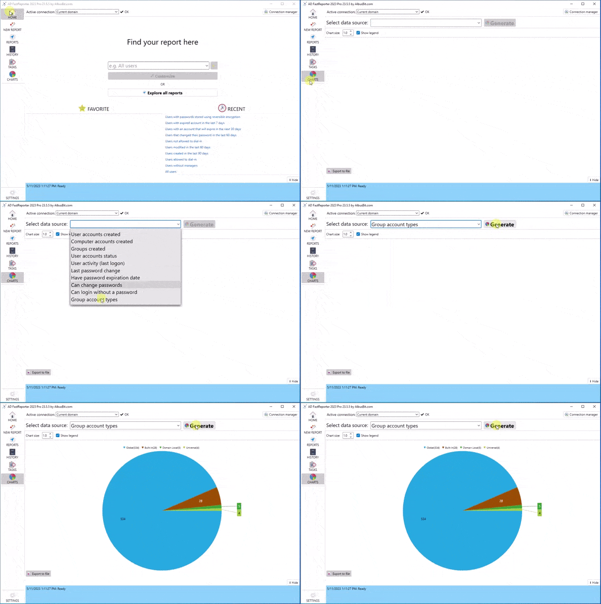
Charts - Visualize Your Active Directory Data with AD FastReporter
Understand your Active Directory environment with ease. AD FastReporter's innovative chart generation feature allows you to visualize key data with beautiful, intuitive pie charts. Take your AD management and decision-making processes to the next level.
Innovative Chart Generation
Choose from 10 built-in chart data sources, such as 'User Accounts Created', 'User Activity (last logon)', 'Group Account Types', and more. Immediately grasp the state of your Active Directory, identifying trends and issues at a glance.
Easy Export for Sharing and Analysis
Easily export these informative charts to share with your team or for further analysis. Make the most of your data with AD FastReporter's powerful visualization tools.
Visualize Your Data in Action
Experience how AD FastReporter transforms your data into actionable insights. Check out our chart examples below.

Ready to Visualize Your Active Directory Data?
Experience the power of data visualization with AD FastReporter. Download the free version or request a trial key to unlock Pro features for 7 days. Enhance your Active Directory management with Albus Bit.